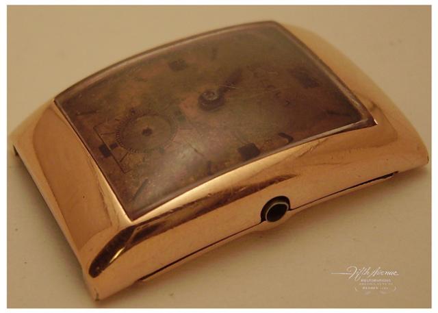
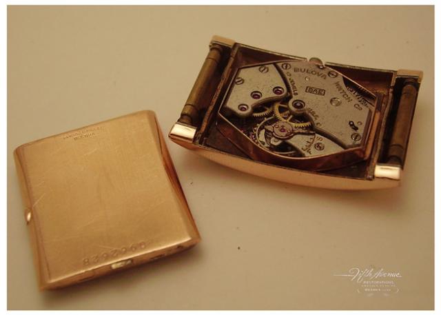
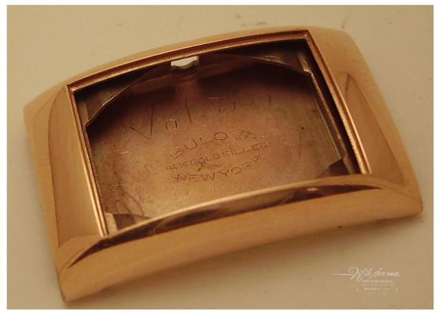
Restoration Project. Rose Gold hidden lug Case measures 31mm x 21mm wide non inclusive of the Crown while using Calipers. Caseback is Rose Gold and stamped as shown.
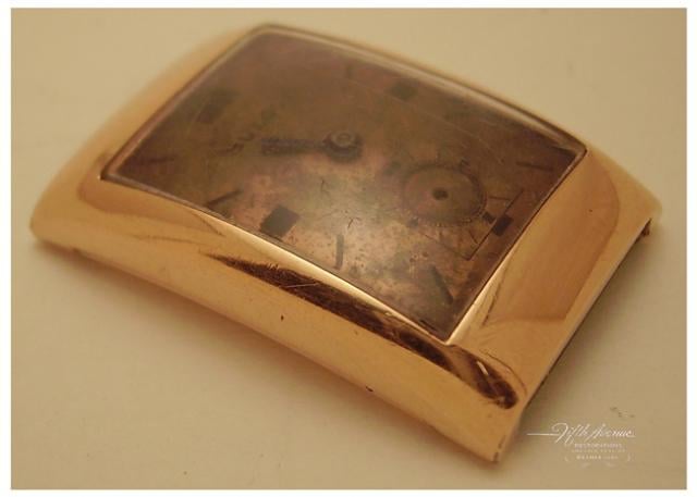
Looks like a match, but I'm still seeing a flatter/smoother bezel then in the ad?
Two ticks from me, and I'm hard pressed not to give three.
EDIT: First sentence above typo. I'm seeing the ad with a flatter bezel w/ "sharper" lines, and the watch with a smoother, rounded bezel.
In reply to I agree Will. If it weren't by DarHin
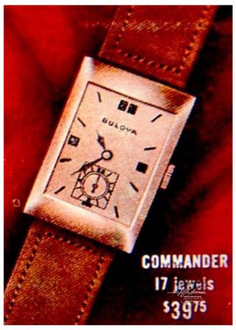
well, if we're going to downgrade firmly established ID's Getlemen here's one more. http://www.mybulova.com/watches/1941-commander-4539
In reply to well, if we're going to by FifthAvenueRes…
I don't think of it as a downgrade or upgrade. Just my opinion on how I've assigned ticks in light of new questions raised- and can be changed back after we discuss those questions. It's like my one tick for the 1935 Conrad/Conqueror recently published. There's certainly a bunch of ID's we can work on getting closer to what we think is right today :)
EDIT: or my pending one tick for the solid gold Douglas, while entered as it is today :)
A two dimensional artist's "head-on"rendition will never match a three dimentional corporeal three quarter-on photograph, even when the "Artist" has shaded the upper and lower bezel to give a curved perspective to the subject.
If you look or even stare at the artwork, it starts to have a little more depth, and looks curved.
Commander 3 ticks.
EDIT:- It's no secret Mark and I don't get on, but this watch is stunning in it's simplicity, and is a true classic of design in my humble opinion.
I knows what I likes, and I likes what I sees! uuuug, ug ug ug!
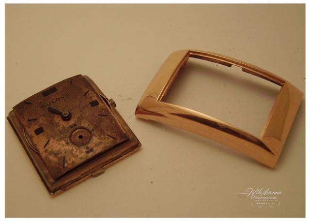
...and the dial is an exact match, along w/ everything else....the case differences I bring up can be artist rendition issues, as I doubt Bulova made a diff watch with this very shape and exact dial. I'm just going through old records and seeing what I thought a week (or six months) ago.
