Hello All,
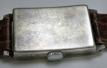
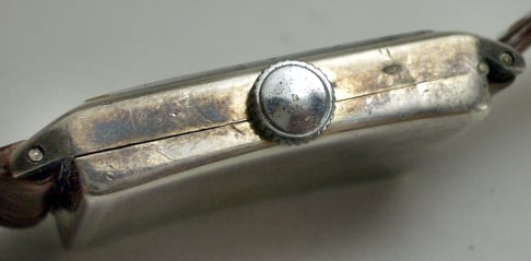
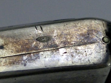
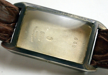
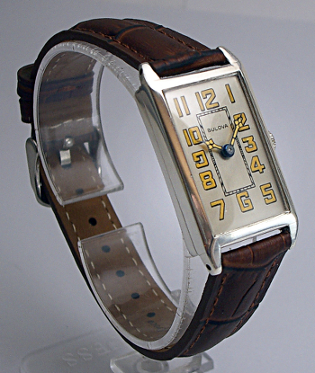
I picked this one up at auction last week. I thought it was interesting enough to post, and worthy of restoration. I thought I had seen something similar on the site, but can't locate it. Notice the Hallmark on the side of the case near the crown. I am not sure if we will be able to pin this one down.
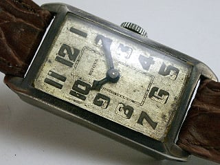

The Oxford in the ad shows a different orientation of the numbers; and the bezel and lugs do not appear smooth, perhaps ribbed or lines - can't tell if the subject watch is smooth or perhaps worn down. This could be the design of the sterling version - smooth finish and different number orientation.
Hi Jeff, what a fantastic watch! this certainly was a good find, well done. I'm going along with the 1925 date, the open "9" also indicate that era. I'm a little soft on and Oxford ID but would go tentative. Ken has a good point on the dial difference but I'll choose to overlook that. The lug difference is artist rendition to my eye.
Oxford, nice ad match Bob.
I think the "lines" are just the way the printer has represented a sloping surface, giving the picture depth and focus.
From studying old adverts, I have found that many of these older ones are not artist's impressions, but printer facsimiles of actual photographs. Below are two 1912 Gruen ads. The older uses a photo, the newer a "photocopy" of the first. You can see what I mean with these examples.

See how the copier has but lines in the silk lining to add depth and texture?

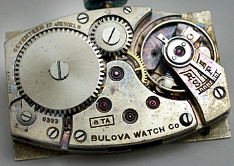
In reply to Thought I would share the by timerestoration